Struggling to make your self-published book look as professional as the content inside? You’re not alone. Typography – the art of arranging text – is often the hidden difference between a book that feels amateur and one that screams “bestseller.”
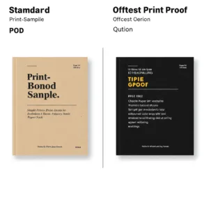
Book typography best practices center on maximizing readability and creating a visual hierarchy that guides the reader. This involves selecting a limited number of fonts (2-3) that complement each other (e.g., a serif for body text and a sans-serif for headings), setting appropriate line spacing (1.2x to 1.5x font size), using a comfortable line length (50-75 characters for English), and establishing clear heading styles to structure the content. Consistent margins, proper alignment (typically left-aligned or justified for English), and attention to detail (avoiding orphans and widows) are also crucial.
This article provides clear and concise guidelines for achieving professional-level typography in your self-published books, enhancing readability, and contributing to a polished presentation that captivates readers. We’ll walk through font selection, spacing, hierarchy, and even free tools to make it happen – no design degree required.
1. Why Typography Matters More Than You Think
The Psychology of Type
Typography is far more than just making your book look pretty. It’s about shaping the reader’s experience on a subconscious level. The fonts you choose, the way you arrange them, and the space you create around them all contribute to how your words are perceived. Different typefaces evoke different emotions and associations. Serif fonts, like Times New Roman or Georgia, often convey a sense of tradition, authority, and trustworthiness. This makes them a solid choice for genres like historical fiction or academic texts where credibility is key.
When your book is beautifully and professionally typeset, readers unconsciously assume the content is of equally high quality. It’s a subtle but powerful way to build trust and credibility. Conversely, a poorly typeset book can instantly undermine even the most brilliant writing. It affects “cognitive fluency”. When text is easy to read, it’s also easier to understand and remember.
How Bad Typography Hurts Your Book

Let’s be honest: bad typography can actively sabotage your book’s success. Imagine a reader struggling with tiny, cramped text, inconsistent spacing, or a confusing jumble of fonts. They’re likely to put the book down, leave a negative review, or even request a refund. Here are some of the most common typography mistakes that can turn readers away:
- Font Overload: Using too many different fonts creates a chaotic, unprofessional look. Stick to 2-3 fonts at most.
- Clashing Fonts: Some fonts simply don’t work well together.
- Tight Squeeze: Insufficient line spacing (leading) makes text feel cramped and difficult to read.
- Marathon Lines: Excessively long lines of text strain the reader’s eyes.
- Tiny Margins: Inadequate margins make the page feel crowded and claustrophobic, particularly bad for printing, as crucial text may be cut off.
- No Visual Hierarchy: A wall of text with no clear headings or subheadings is overwhelming and difficult to navigate.
- Orphans and Widows: Leaving single words or short lines at the top or bottom of a page or column disrupts the flow of reading.
- Rivers of White: Gaps that appear to run down a paragraph of text, are distracting for the reader.
These mistakes don’t just make your book look bad; they have real financial consequences. Poor readability can lead to lower sales, negative reviews (a major deterrent for potential buyers), and increased return rates, all impacting your overall book pricing strategy.
2. The Indie Author’s Typography Toolkit

This is where we equip you with the knowledge you need to make confident typography decisions. No design degree required!
Choosing the Right Fonts
Font selection can feel daunting, but it doesn’t have to be. The key is to keep it simple and focus on readability.
Serif vs. Sans-serif vs. Display vs. Script vs. Monospace
- Serif Fonts: These fonts have small decorative strokes (serifs) at the ends of letters. They’re often considered more traditional and are excellent for body text in print, as the serifs help guide the eye along the line, and are commonly used in both offset vs digital printing. Examples: Times New Roman, Georgia, Garamond, Baskerville.
- Sans-Serif Fonts: These fonts lack the serifs, giving them a cleaner, more modern look. They’re often preferred for on-screen reading and work well for headings and shorter blocks of text. Examples: Helvetica, Arial, Open Sans, Roboto, Lato.
- Display Fonts: These are bold, eye-catching fonts designed for headlines and titles. They’re not suitable for body text. Examples: Impact, Bebas Neue, Lobster.
- Script Fonts: These fonts mimic handwriting and can add elegance or a personal touch. Use them sparingly, primarily for accents or short titles. Examples: Pacifico, Brush Script MT, Allura.
- Monospace Fonts: Every character takes up an equal amount of horizontal space. Used for setting code or when a retro aesthetic is wanted.
The Art of Font Pairing
Just like you wouldn’t wear ten different colors at once, you shouldn’t overload your book with too many fonts. A good rule of thumb is to stick to 2-3 fonts max. Here’s how to pair fonts effectively:
- Family Affair: The easiest approach is to use different weights and styles within the same font family. For example, use Open Sans Light for your body text, Open Sans Regular for emphasis, and Open Sans Bold for your headings. This creates a cohesive and harmonious look.
- Contrast is Key: If you want to use different font families, pair a serif with a sans-serif. This classic combination provides clear visual distinction. For example, use a traditional serif like Garamond for your body text and a modern sans-serif like Montserrat for your headings.
- Superfamilies to the Rescue: Some font families, known as “superfamilies,” include both serif and sans-serif variations designed to work together seamlessly. Examples include Merriweather and Merriweather Sans, and Libre Baskerville and Libre Franklin.
Where to Find High-Quality, Free Fonts
You don’t need to break the bank to find beautiful, professional-looking fonts. Here are some excellent resources:
- Google Fonts: A vast library of free, open-source fonts, many of which are specifically designed for readability. Use the filtering options to find fonts suitable for body text and print, and take a look at their article about variable fonts to take your text to the next level.
- Font Squirrel: Another great source for free fonts, with a focus on high-quality, commercially usable options. Check out their “Almost Free” section.
- The League of Moveable Type: A curated collection of well-designed, open-source fonts.
It is important, however, to note that there can be some quality issues with completely free fonts, so research is key.
Mastering Readability: Line Length, Leading, and Spacing

Choosing the right fonts is just the first step. How you use those fonts is equally crucial for readability.
The Golden Ratio of Line Length
Line length (the width of your text block) significantly impacts reading comfort. If lines are too long, the reader’s eye gets tired tracking across the page. If they’re too short, the reading rhythm becomes choppy.
The sweet spot for English text is generally considered to be 50-75 characters per line. You can measure this in most word processing and design software.
Leading Like a Pro (Line Spacing)
Leading (pronounced “ledding”) is the vertical space between lines of text. Adequate leading is essential for preventing text from feeling cramped and improving readability.
A good starting point is to set your leading to 1.2x to 1.5x your font size, though Smashing Magazine offer some other perspectives on line-height, depending on your chosen font.
For example, if you’re using a 12pt font, your leading would be between 14.4pt and 18pt. However, you may need to adjust this based on the specific font you choose and the line length. Visually assess; does it look crowded, or just right?
Kerning and Tracking (Letter Spacing)
- Kerning: Adjusting the space between individual letter pairs. This is usually only necessary for display type (like headlines) where inconsistencies in spacing are more noticeable.
- Tracking: Adjusting the overall letter spacing for a block of text. Generally, you won’t need to adjust tracking for body text. However, you might slightly increase tracking for all-caps headings and slightly decrease tracking for very bold fonts to improve visual balance, avoiding common printing mistakes in book.
Paragraph Spacing
Choose either paragraph indents or space between paragraphs, but not both. Using both is redundant and creates excessive white space.
- Indents: A standard indent is typically around 0.25 inches (or the width of two or three characters of your font).
- Paragraph Spacing: If you choose to use space between paragraphs, a good starting point is 0.5x to 1x your line spacing.
Creating Visual Hierarchy
Visual hierarchy helps readers quickly understand the structure of your text and identify the most important information.
The Power of Headings
Use heading levels (H1, H2, H3, etc.) to create a clear outline of your content. Your headings should be significantly larger and bolder than your body text. Maintain consistency in your heading styles throughout your book.
Using White Space Effectively
White space (also known as negative space) isn’t empty space; it’s a crucial design element. It includes margins, gutters (the space between facing pages), and the space around headings and other elements, and even understanding concepts like bleed lines for printing is important for a professional finish. Generous white space makes your text more inviting and easier to read. For paperback books, set margins to at least 0.75″, and for hardback, set interior margins to 1″.
Other Hierarchy Elements
- Subheadings: Break up long sections of text and provide additional structure.
- Bulleted and Numbered Lists: Use them to present information in a concise, scannable format.
- Block Quotes: Set off long quotations from the main text.
- Drop Caps: A large initial letter at the beginning of a chapter or section can add a touch of elegance, but use them sparingly.
- Images and Captions: Use these to explain concepts, or break up large blocks of text.
Mastering Print-Specific Details

Understanding DPI and Resolution
DPI and Resolution: For a crisp, clear print, all images must be 300 DPI.
Bleed and Trim
Bleed and Trim: “Bleed” is the area beyond the edge of where your book will be physically cut (“Trim”). This ensures that your design has no white, unprinted edges.
CMYK vs. RGB
CMYK vs. RGB: “RGB” is the color space for screens, and “CMYK” is the color space for printing. Make sure your document is set to CMYK for accurate color representation.
As Robert Bringhurst wisely stated in his seminal work, The Elements of Typographic Style, “Typography exists to honor content.” Keep this principle at the forefront of your mind as you make your design choices.
3. Software & Tools: From Free to Pro
Choosing the right software is a crucial step in bringing your perfectly typeset book to life. Here’s a breakdown of options, ranging from budget-friendly to professional-grade.
Free Options for Budget-Conscious Authors
- Google Docs: While primarily a word processor, Google Docs offers basic typography controls (font selection, size, leading, alignment). It’s readily accessible and free to use. However, its limitations become apparent with longer, more complex books. Export options include PDF (for print) and EPUB (for ebooks), but the conversion isn’t always perfect.
- Reedsy Book Editor: This is a fantastic free tool specifically designed for book formatting. It offers a clean, intuitive interface and handles many of the technical details automatically. It’s particularly strong for straightforward novels and non-fiction books. However, font choices and customization options are somewhat limited. [Include a link to a Reedsy Book Editor tutorial].
- Scribus: This is a powerful, open-source desktop publishing program (think of it as a free alternative to InDesign). It offers a vast array of features, including precise control over typography, layout, and color management. However, it has a steeper learning curve than the other free options. [Include a link to a Scribus tutorial].
- LibreOffice Writer: As a free, open-source alternative to Microsoft Word, this offers more robust typesetting features than Google Docs.
Paid Options for Professional Results
- Adobe InDesign: This is the industry-standard software for professional book design and layout. It offers unparalleled control over every aspect of typography, from kerning and tracking to OpenType features and complex layouts. However, it’s subscription-based and has a significant learning curve. [Include a link to an InDesign tutorial]. If your book has a complex layout, with many images, tables, or design elements, InDesign is the best choice.
- Affinity Publisher: This is a compelling alternative to InDesign, offering a similar feature set at a one-time purchase price (making it much more affordable in the long run). It’s gaining popularity among independent authors and designers for its intuitive interface and powerful capabilities. [Include a link to an Affinity Publisher tutorial].
- Vellum (Mac only): Vellum is a specialized book formatting software exclusively for Mac users. It’s known for its ease of use and beautiful, pre-designed templates. It simplifies the process of creating both print and ebook versions of your book. However, it’s relatively expensive. [Include a link to a Vellum tutorial].
- Atticus (Mac & PC): A more recent, cross platform addition, this is very similar to Vellum.
Choosing the Right Tool for Your Needs
| Feature | Google Docs | Reedsy Book Editor | Scribus | LibreOffice Writer | Adobe InDesign | Affinity Publisher |
|---|---|---|---|---|---|---|
| Price: | Free | Free | Free | Free | Subscription | One-time Purchase |
| Ease of Use: | Very Easy | Easy | Hard | Moderate | Hard | Moderate |
| Features: | Basic | Moderate | Advanced | Moderate | Advanced | Advanced |
| Print Focus: | Limited | Good | Excellent | Good | Excellent | Excellent |
| Ebook Focus: | Basic | Excellent | Good | Good | Good | Good |
| Best For: | Simple texts | Novels, Non-fiction | Complex layouts | General Use | Professional design | Professional design |
This table should help you quickly compare the options and decide which tool best suits your budget, skill level, and project requirements.
4. Ebook Typography: Adapting Your Design for Digital Readers
Creating an ebook isn’t simply about converting your print-ready PDF. Ebooks have unique characteristics and limitations that you need to consider.
The Key Differences Between Print and Ebook Typography
- Reflowable Text: Unlike print books, where the layout is fixed, ebook text reflows to fit different screen sizes and reader-adjustable settings (font size, line spacing). This means you have less control over the final appearance.
- Limited Font Choices: Ebook readers don’t support all fonts. You’re generally limited to a set of “web-safe” fonts or fonts specifically designed for e-readers.
- Device Variations: Ebooks are read on a wide range of devices, from small smartphones to large tablets, each with different screen resolutions and capabilities.
Best Practices for Ebook Typography
- Font Selection: Stick to widely supported fonts like Arial, Georgia, Times New Roman, Verdana, or e-reader optimized fonts like Amazon Ember or Bookerly. This ensures your book will display correctly on most devices.
- Minimize Formatting: Avoid excessive use of bold, italics, and different colors, as these may not translate well to all e-readers or could be overridden by the reader’s preferences.
- Clickable Table of Contents: Create a dynamic table of contents that allows readers to jump to different chapters with a single tap. This is essential for ebook navigation.
- Image Optimization: Compress your images to reduce the overall file size of your ebook. Large files can slow down loading times and take up valuable storage space on the reader’s device.
- Paragraph Styles: Use paragraph styles (Heading 1, Heading 2, Body Text, etc.) consistently. This ensures proper structure and formatting when your manuscript is converted to an ebook format.
- Test, Test, Test: Preview your ebook on as many different devices and e-reading apps as possible before publishing. This is the only way to catch potential formatting issues. By following these guidelines, you can create an ebook that is both visually appealing and easy to read on any device. This section speaks directly to the “paperback and ebook” pain point identified for your target audience.
5. Conclusion
Typography is more than just picking a pretty font. It’s about crafting a reading experience that is both enjoyable and effective. It’s about honoring your content and respecting your readers. As an independent author, you have the power to create a book that looks and feels as professional as any traditionally published work. By understanding the principles of readability, choosing fonts wisely, mastering spacing and layout, and utilizing the right tools, you can elevate your book from amateur to pro, even on a limited budget.
6. Appendix
This appendix provides additional resources to further your typography journey.
Glossary of Typography Terms
- Ascender: The part of a lowercase letter that extends above the x-height (e.g., the top of the ‘b’ or ‘h’).
- Baseline: The invisible line on which most letters sit.
- Body Text (or Body Copy): The main text of your book.
- Cap Height: The height of a capital letter from the baseline to the top of the letter.
- Descender: The part of a lowercase letter that extends below the baseline (e.g., the tail of the ‘p’ or ‘g’).
- DPI (Dots Per Inch): A measure of print resolution. 300 DPI is the standard for high-quality printing.
- Font: A specific style of typeface (e.g., Bold, Italic, Regular).
- Font Family: A group of related fonts (e.g., Open Sans, Open Sans Bold, Open Sans Italic).
- Kerning: The adjustment of space between individual letter pairs.
- Leading (Line Spacing): The vertical space between lines of text.
- Ligature: A special character that combines two or more letters into a single glyph (e.g., ‘fi’ or ‘fl’).
- Orphan: A single word or short line at the end of a paragraph that appears at the top of a new page or column.
- Point (pt): A unit of measurement for type size (1 pt = 1/72 inch).
- Sans-Serif: A typeface without serifs (the small strokes at the ends of letters).
- Serif: A typeface with serifs.
- Tracking (Letter Spacing): The uniform adjustment of space between all letters in a block of text.
- Typeface: A particular design of type (e.g., Times New Roman, Helvetica).
- Weight: The thickness of a font (e.g., Light, Regular, Bold, Black).
- Widow: A single word or short line at the beginning of a paragraph that appears at the bottom of a page or column.
- X-height: The height of the lowercase ‘x’ in a particular typeface. This is a key factor in determining the overall visual size and readability of a font.
Checklist for Pre-flighting Your Book
Use this to help you ensure all is ready.
- [ ] Font Consistency: Are you using a limited number of fonts (2-3) and are they paired appropriately?
- [ ] Font Licensing: Do you have the correct licenses for all fonts used (for both print and ebook, if applicable)?
- [ ] Font Embedding: (For ebooks) Are all fonts properly embedded in the file?
- [ ] Readability: Is the body text font size appropriate for the target audience and format?
- [ ] Line Spacing (Leading): Is there enough space between lines of text for comfortable reading?
- [ ] Line Length: Are lines of text an appropriate length (50-75 characters for English)?
- [ ] Margins: Are margins adequate for the chosen format (print or ebook)?
- [ ] Visual Hierarchy: Is there a clear visual hierarchy using headings, subheadings, and other formatting elements?
- [ ] Orphans and Widows: Have you checked for and eliminated any orphans and widows?
- [ ] Rivers: Have you checked for and eliminated any distracting “rivers” of white space?
- [ ] Image Resolution: (For print) Are all images high-resolution (300 DPI)?
- [ ] Image Compression: (For ebooks) Are images optimized for file size without significant quality loss?
- [ ] Color Space: (For print) Is the document set up in CMYK color mode?
- [ ] Bleed: (For print) Have you included sufficient bleed if your design extends to the edge of the page?
- [ ] Proofreading: Has the text been thoroughly proofread for any typos or errors?
- [ ] Table of Contents: Is it included, and accurate?
- [ ] Testing: (For ebooks) Have you tested the ebook file on multiple devices and e-reading apps?